Improving the dashboard design of a complex data platform
Project Overview
Datalytix is one the leading platforms for handling large datasets of water purification plants and controlling hundreds of IoT device data to control critical systems and optimise efficiency.
We were briefed to improve the user experience of the data visualisation platform to scale as a product in a growing market.
The Challenge
The UI and visual design of the interface felt outdated and overwhelming, the interaction design was not very functional and lacked customisable options for different users.
In addition, there was no form of an onboarding process to get the users familiar with how to use the interface.
Approach
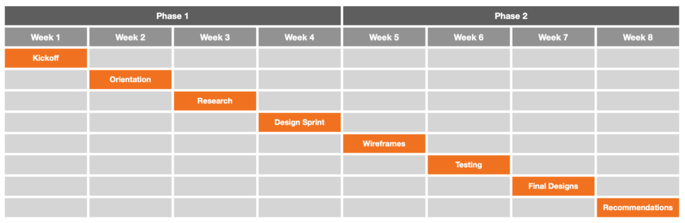
We agreed on a 2-phase journey over 8 weeks, with the first part focussing on discovery and research, and the second part delivering a visual design concept. My involvement was facilitating research, leading workshops, and guiding the visual design deliverables with my team.
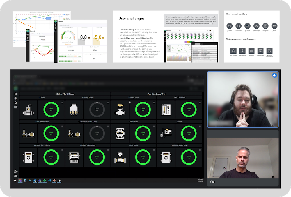
Research
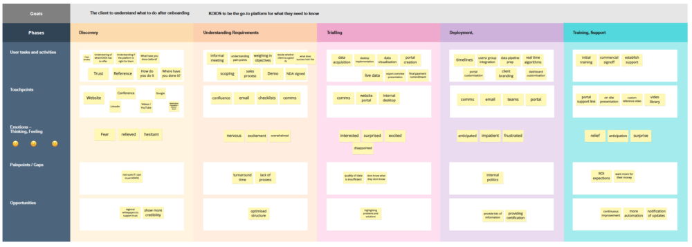
The first phase contained a lot of market research and competitive analysis, as well as discovery & design workshops, interviews, persona work, and initial user journey mapping.
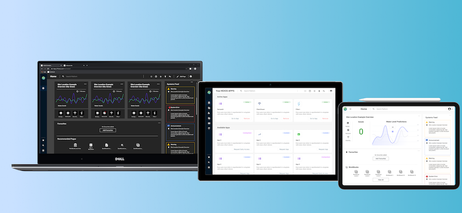
Wireframes and final designs
After documenting and reviewing all insights from the research and workshops, we went ahead through phase 2 and developed the recommended design concept and prototype.
The sections outline the onboarding process which includes a user profile identification, the home dashboard configuration, the site-view (plant) with all the modules, and third-party apps screens.

The following screen recording shows the walkthrough of the prototype.