
RMIT Online
New Website & Study Portfolio
Project Overview
RMIT Online is one of the leading online universities in Australia and is constantly growing and expanding its student offer portfolio. The website and frontpage of RMIT Online needed to show the complete course catalog with all information while strongly communicating the RMIT credentials and the benefits of studying online.
The Challenge
The old website was not including the complete portfolio, the connection to the in-house, third party and separate course portfolios had been a messy experience and not user-friendly.
Research

We started off with key stakeholder workshops to set initial assumptions, expectations and features. My role was to facilitate and guide these workshops.

I took those insights to develop first hand drawn features and modules for the first page wireframes.

Then we used these layouts for our first round of user interviews and impression testing. I was facilitating, planning and executing on these interviews, I’ve documented all interviews in video & audio recordings, extracted insights from each part of their journey and developed a document that later will inform the UX design guidelines.

After analysis and synthesis of the research we identified some key insights: 1 – prospective students had a serious doubts about the quality of online study, 2 – they were thinking it was all just reading text off a screen and 3 – the only support they’d get is a tech-hotline.
To address these concerns, the strategy going forward was to make the site much more ‘human’, with many references to the team and people behind the study acces, process and support, focus on brand propositions, easy navigation and relatable testimonials.
UI Design

Now it was time to start developing the first lo-fi digital wireframes. I used Sketch to design all wireframes and then also produced the first interactive prototype that we used in the second round of user testing.

I then used the lo-fi wireframes to brief a UI and visual designer to develop hi-fi designs for mobile, tablet and desktop versions, including an interactive prototype.
Design Guide

We collected all research insights and website design screens in a UX Design Guide, which documented design principles and explains the functionality of each of the site modules, interactions and informati0n architecture.
Design System
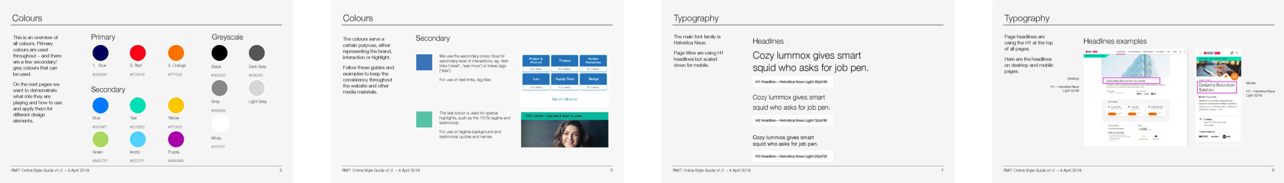
The digital style guide of the site lives in a sketch library, helping the developers to access each component and maintaining consistency in CSS and typography.