 10
Nov
Improving the dashboard design of a complex data platform Project Overview Datalytix is one the leading platforms for handling large datasets of water purification plants and controlling hundreds of IoT device data to control critical systems and optimise efficiency. We were briefed to improve the user experience of the data visualisation platform to scale as
 19
Nov
Project Overview RMIT Online is one of the leading online universities in Australia and is constantly growing and expanding its student offer portfolio. The website and frontpage of RMIT Online needed to show the complete course catalog with all information while strongly communicating the RMIT credentials and the benefits of studying online. The Challenge
 29
Sep
Project Overview I was tasked with looking at the current state of Nando’s Menu and eventually evolving into a digital food ordering system. The Problem Nando’s prides itself on offering customers the ability to customise their meal, however this adds complexity during the ordering process for both the customer and Nando’s staff. Research Looking at
 20
Sep
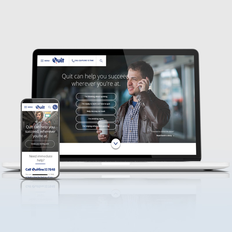
Project Overview The task was to conduct a review on the current Quit Victoria website landing pages and hub-pages, making recommendations on how the user interface could be enhanced to optimise page flow, functionality and user goals – based on a mobile first approach. The following screens show the document I’ve put together to highlight,
 19
Sep
Project Overview The Australian Red Cross briefed us to assess their current site designs they are about to launch – with the focus on creating donation appointments – and give a recommendation of UX optimisation. The Challenge The client needed help with the appointment process and briefed us to optimise and enhance the experience.
 19
Aug
Project Overview Latitude has its own UX team for the app development but I got briefed to develop UX functionality and interaction design for their Landing Page. Research I was reviewing the previous UX/UI for mobile and desktop for reference and collaborating with the UX team on client-side to look at the MVP to focus
 18
Aug
Project Overview One of Latitude’s biggest credit cards is the 28º travel card, which promises no annual fees and foreign currency exchange fees. To communicate the benefits, the landing page shows examples of what the card can be used for. But the current page had some pros and cons and was overall too static.
 27
Jul
Project Overview Flight Delay Pass gives users the option to relax for free in an airport lounge when their flight is delayed. The brief was to design an optimised landing page and eDM concept, based on the actively running marketing campaign (Online + eDM). The Problem Each airport has many lounges provided by multiple airlines.
 10
Nov


Recent Comments